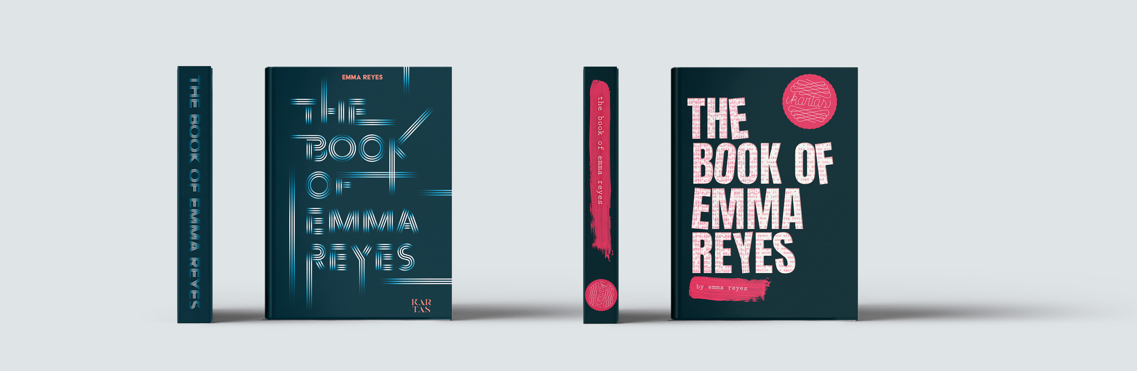

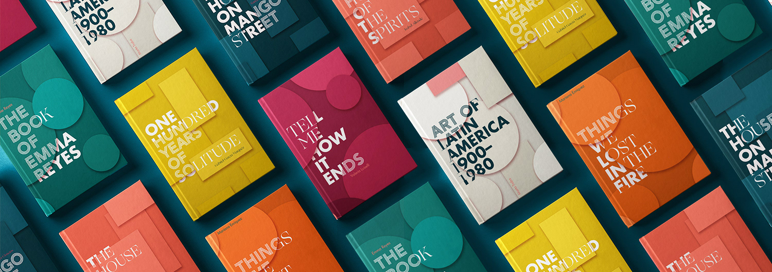
For this speculative branding project, I designed a malleable cover system to brand a publishing house that focuses on work by Latin American writers named Kartas.
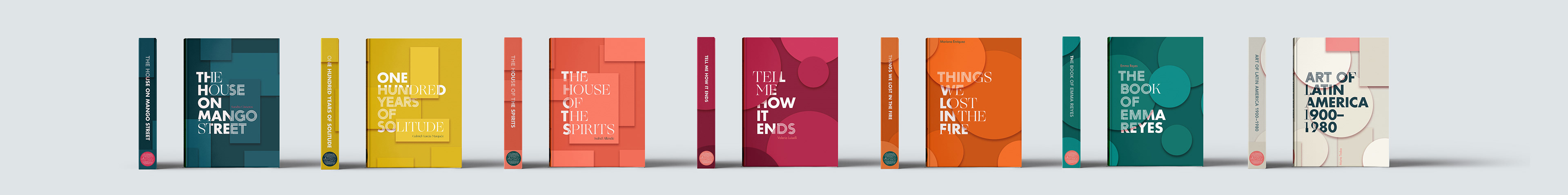
The system included alternative solutions for fiction and non-fiction books as well as history books. It combines basic geometric shapes and 3 radically different typefaces to create new iterations every time.
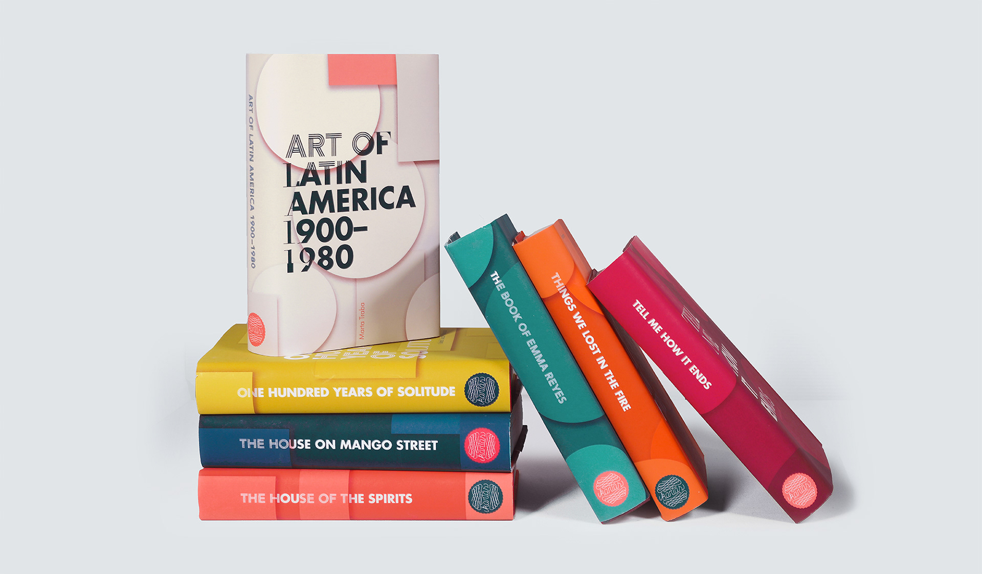
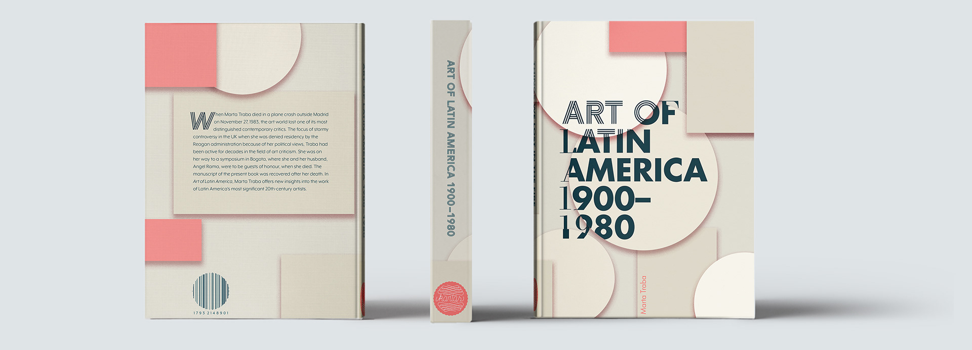
The identity for the history books consists of both the rectangular and circular shapes overlapping as well as the use of secondary hue. Marta Traba's "Art of Latin America 1900—1980" served as the perfect title to use as an example.
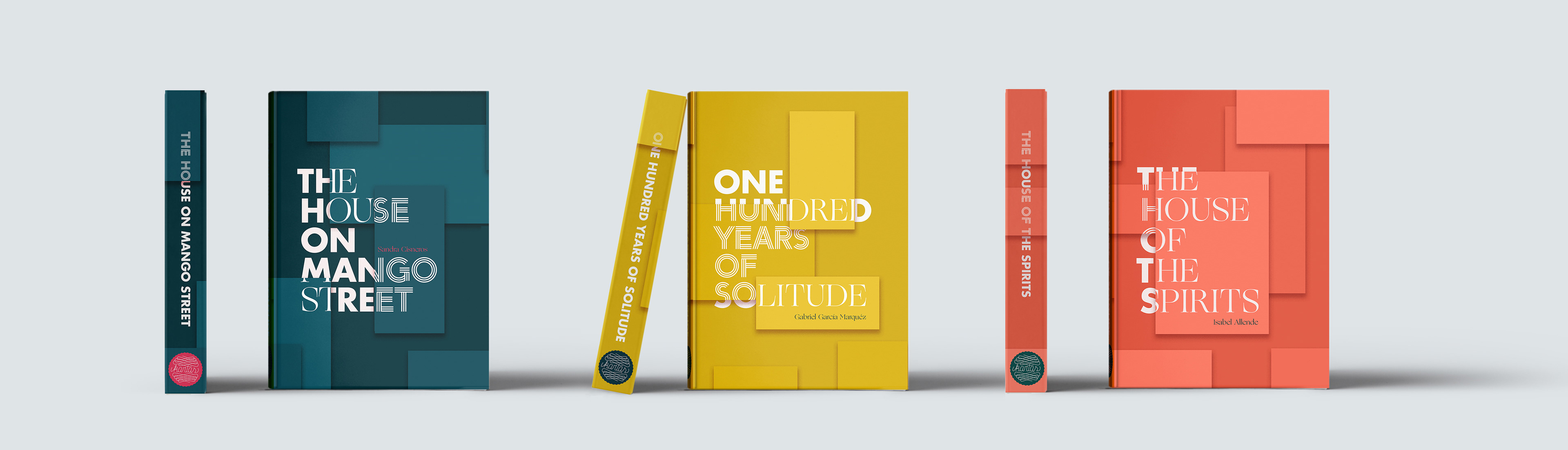
For the fiction genre, the system is constrained to use only rectangular shapes, however many and in any size. Each card is assigned it's own typeface making for interesting combinations every time.
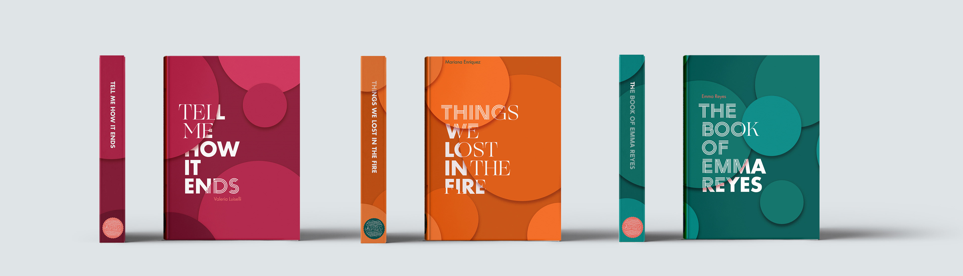
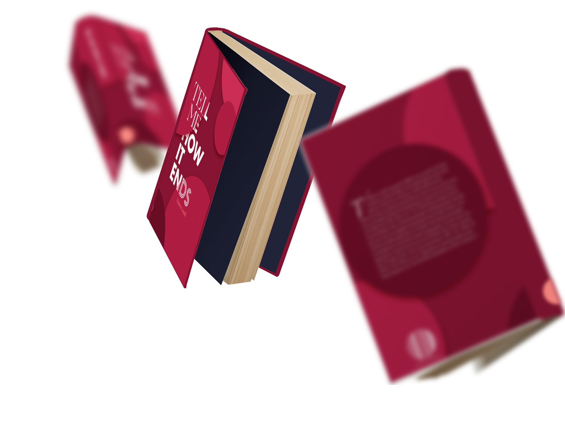
Similar to the fiction covers, the non-fiction system uses circular shapes that overlap adding dimension to the cover, while still being recognizable.
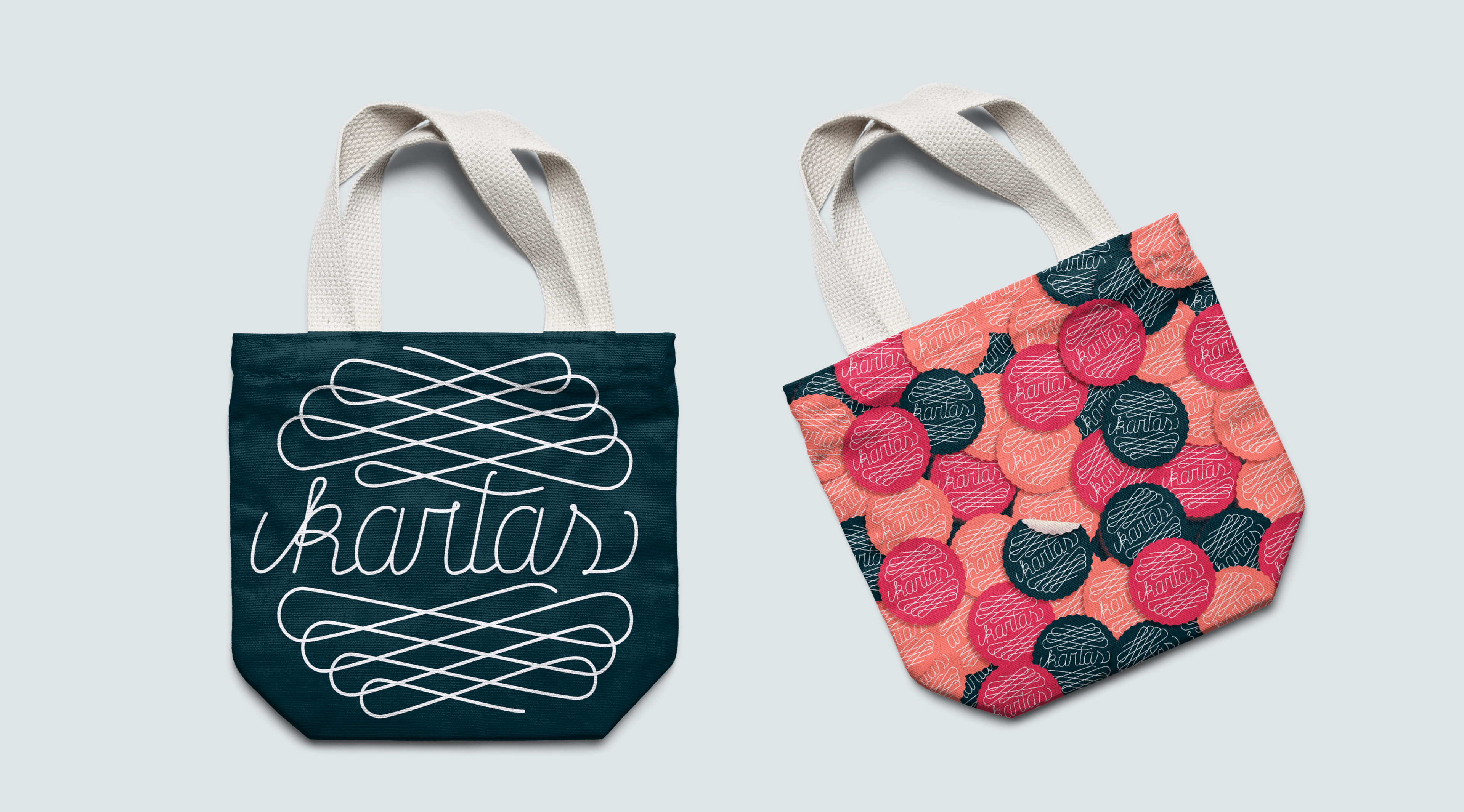
The word Kartas is a play on the Spanish word cartas, which translates to letters, as well as playing cards. The hand-lettered logo was inspired by wax seals and comes in a varied color palette to work with the malleable system.


Below are two initial concepts that didn't move forward as the system wouldn't be as expandable as the chosen one.