
Anatomy of Wings ·Film Branding
Anatomy of Wings is a coming of age feature documentary filmed over the course of ten years. Directed by Kirsten D’Andrea Hollander and Nikiea Redmond, and set in Baltimore, MD it documents the lives of ten young women as they grow up.
I was commissioned by the directors to illustrate and design the poster, develop the brand identity, lower thirds and electronic press kit (EPK).
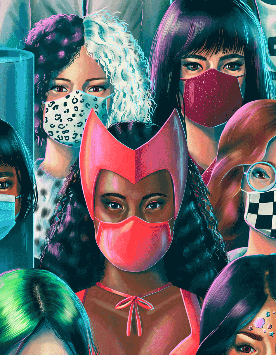
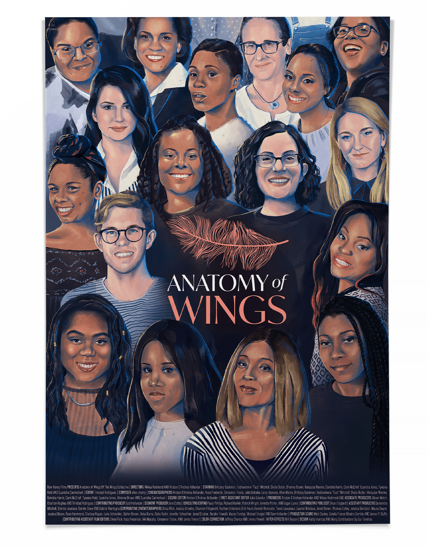
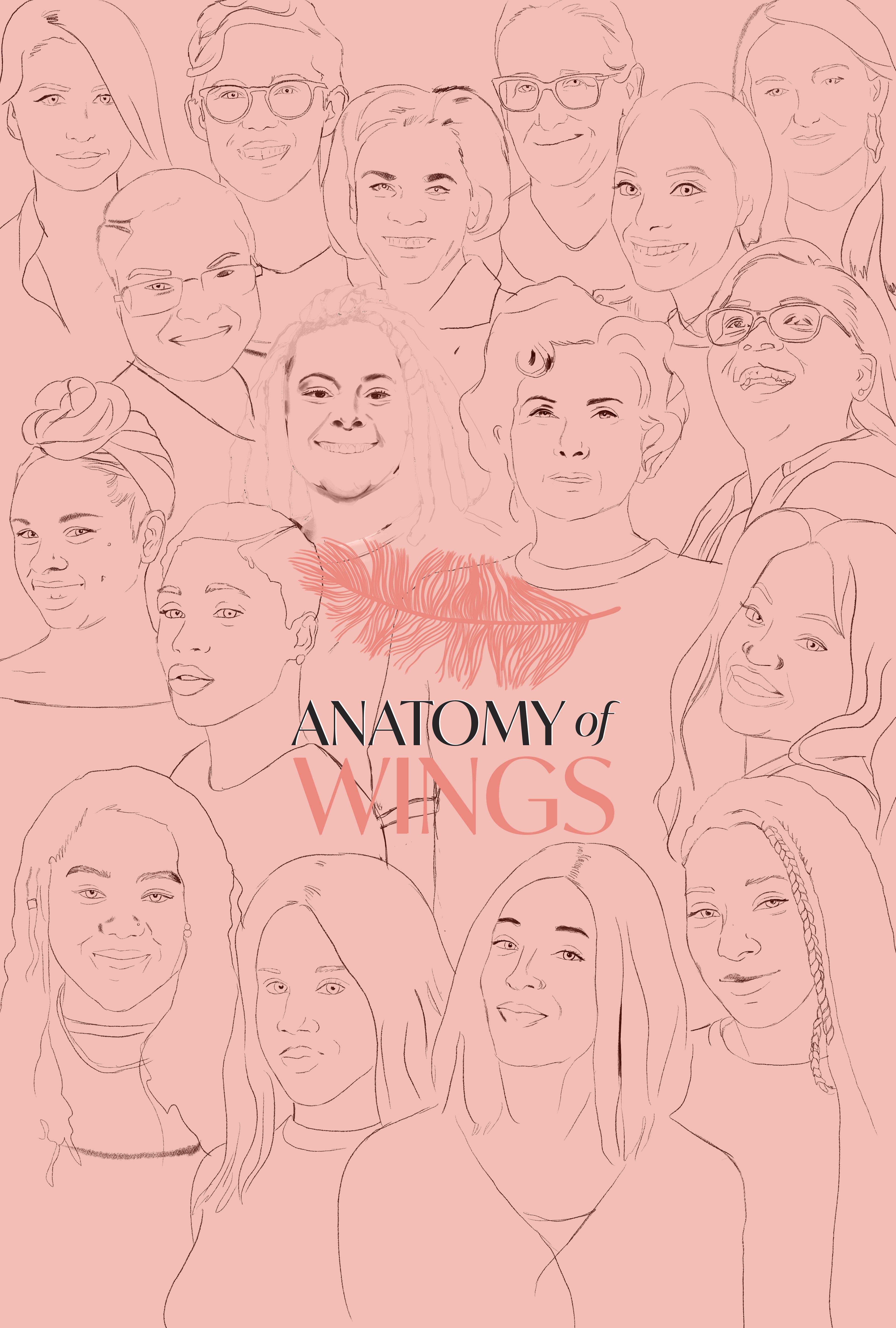
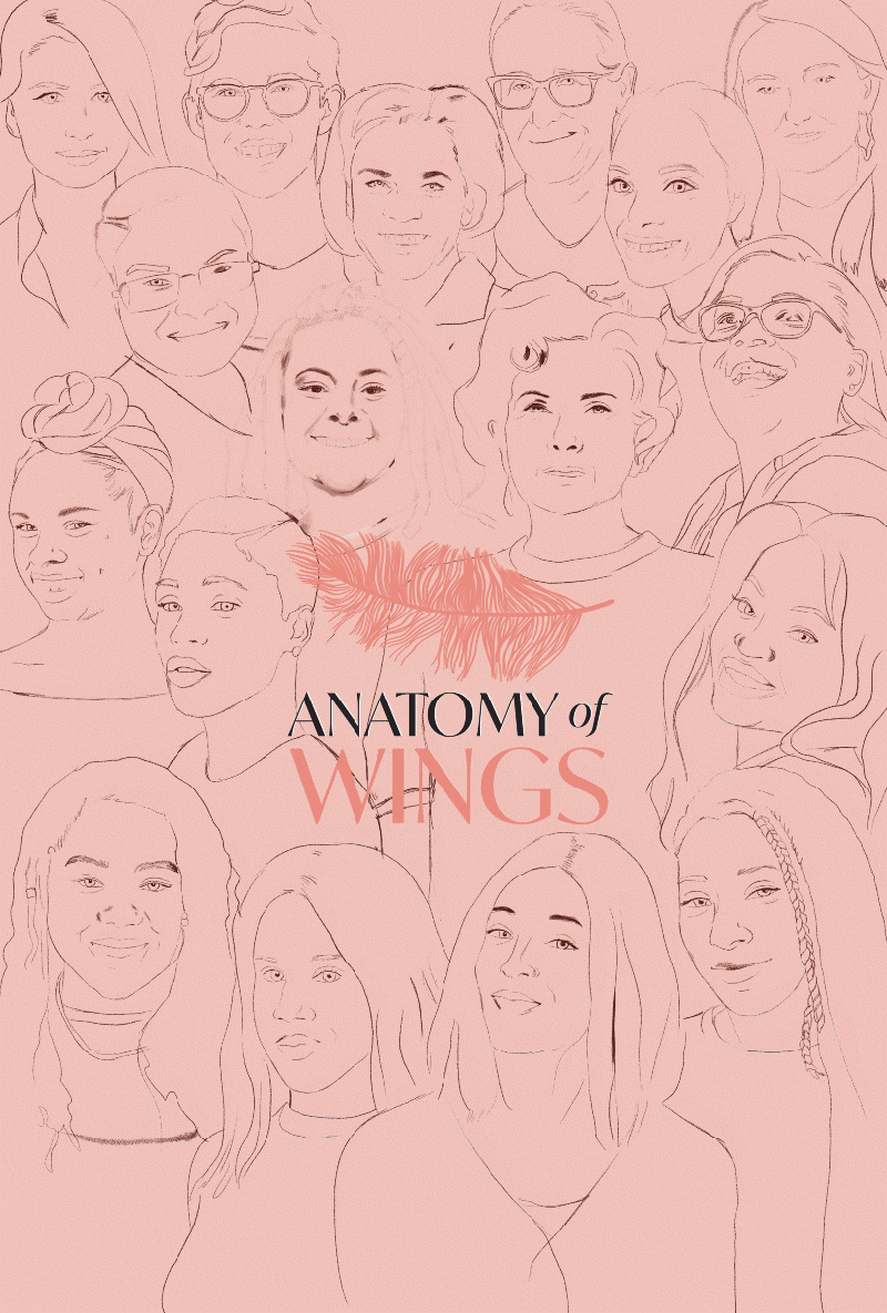
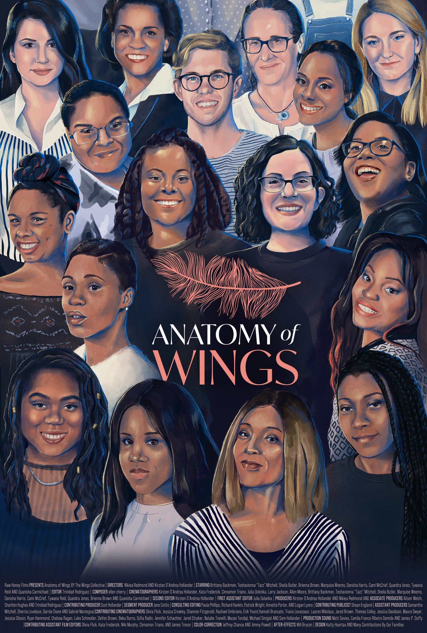
The poster is a compilation of portraits featuring the cast and crew behind Anatomy of Wings. Below you can see the sketch, work in progress and poster reveal.
Film Identity
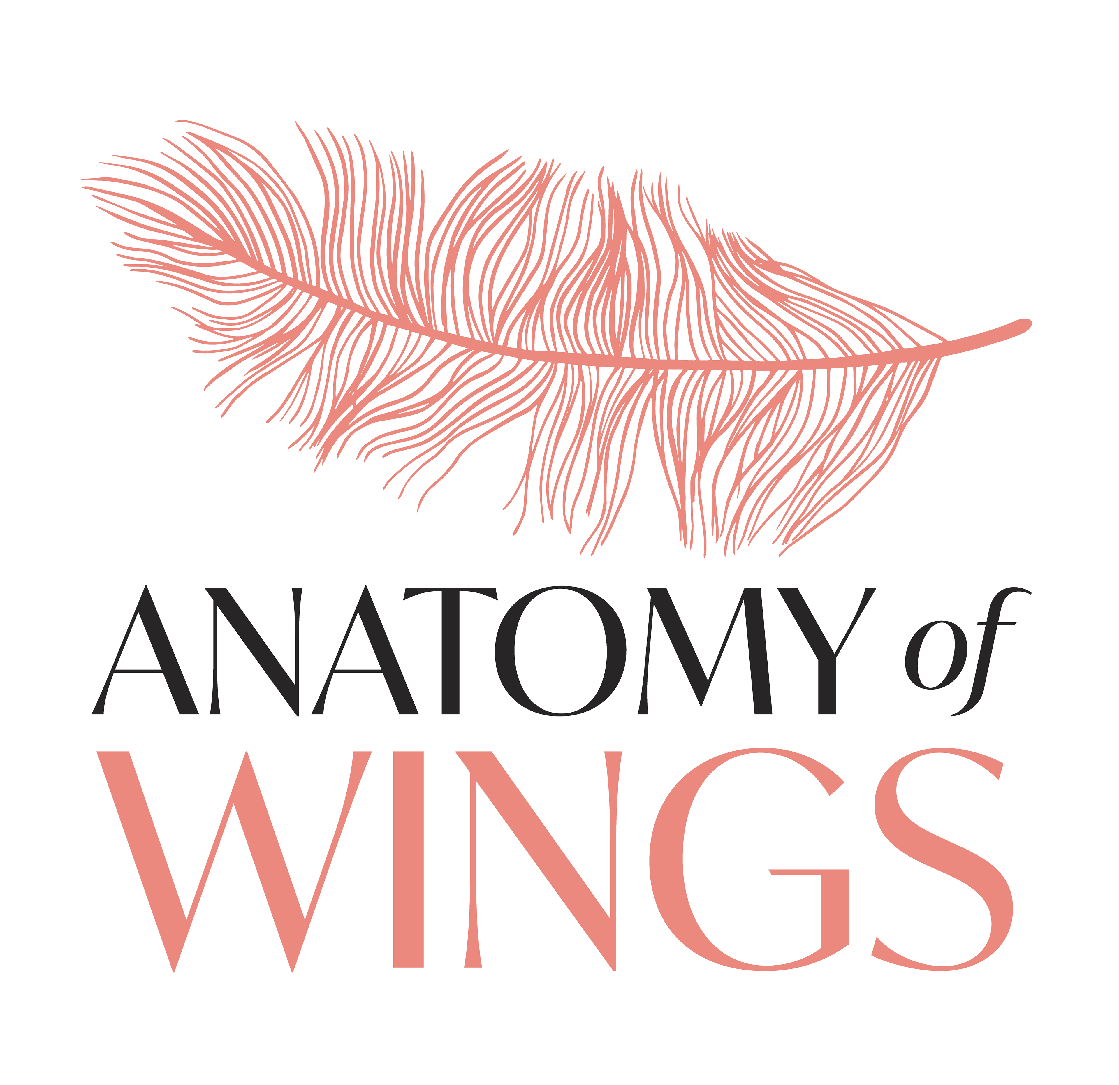
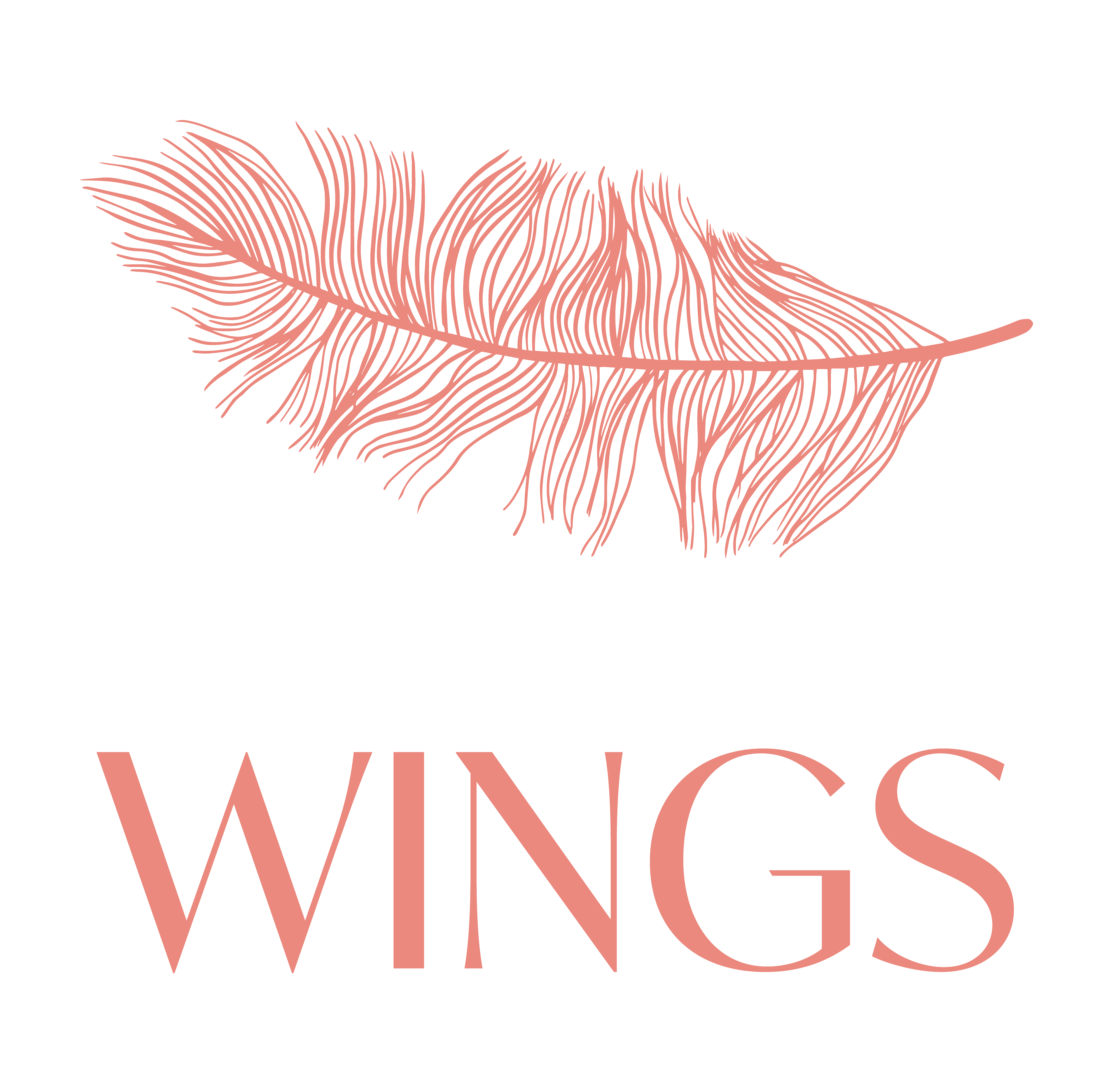
The feather in the logo was derived from a drawing exercise the girls did when they were young depicting "wings". A frame-by-frame animation of the logo was created to keep the handmade nature of the mark.


To keep with the hand-drawn feel of the logo, a system of frame-by-frame animated lines and underlines was developed to tie in the lower thirds and opening screens. Century Gothic was used for the typography, and the lower thirds were color coded so each of the main characters had it's own graphic sub-identity.