
Chief is private network/clubhouse for successful women located in New York City. For this speculative re-branding project I created a swanky system inspired by their space as well as their irreverent presence.
This is a concept rebranding project done at MICA under Abbott Miller's guidance.
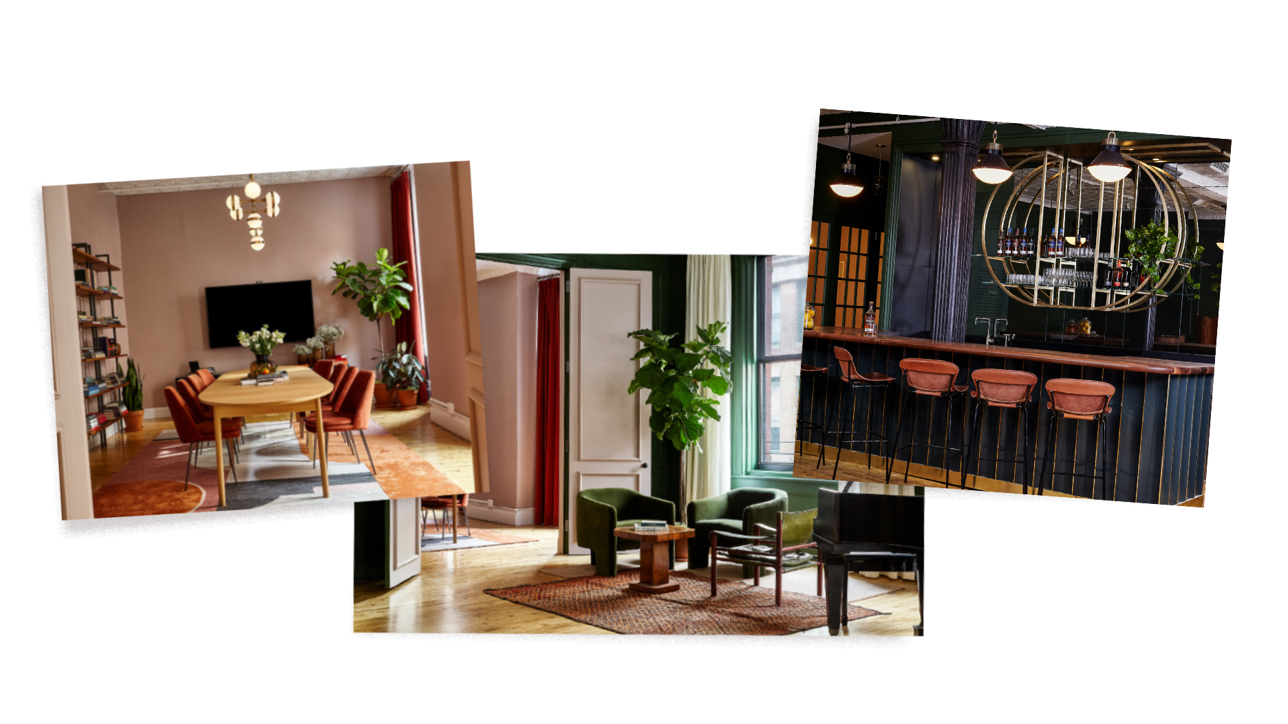
Images taken from Chief.com
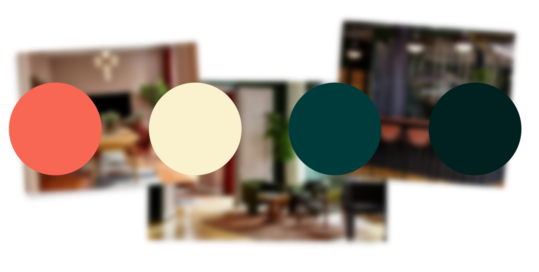
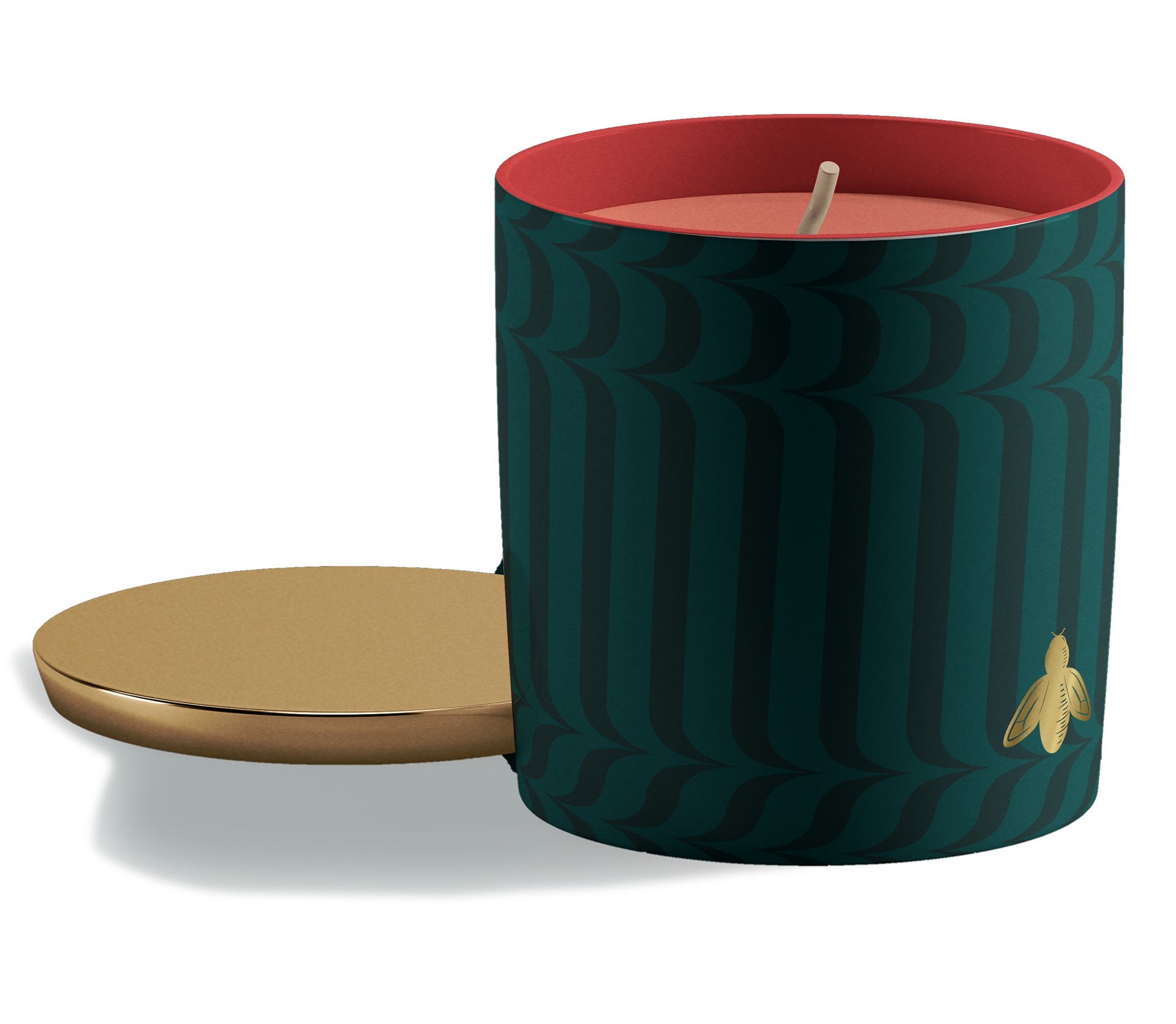
Color palette inspired from the space.
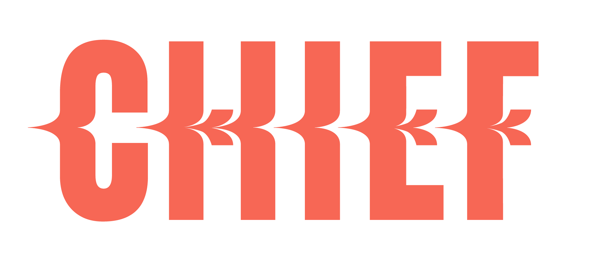
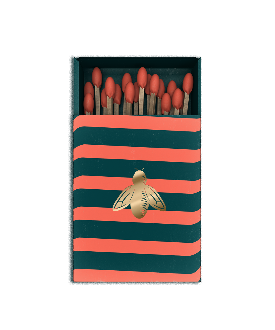
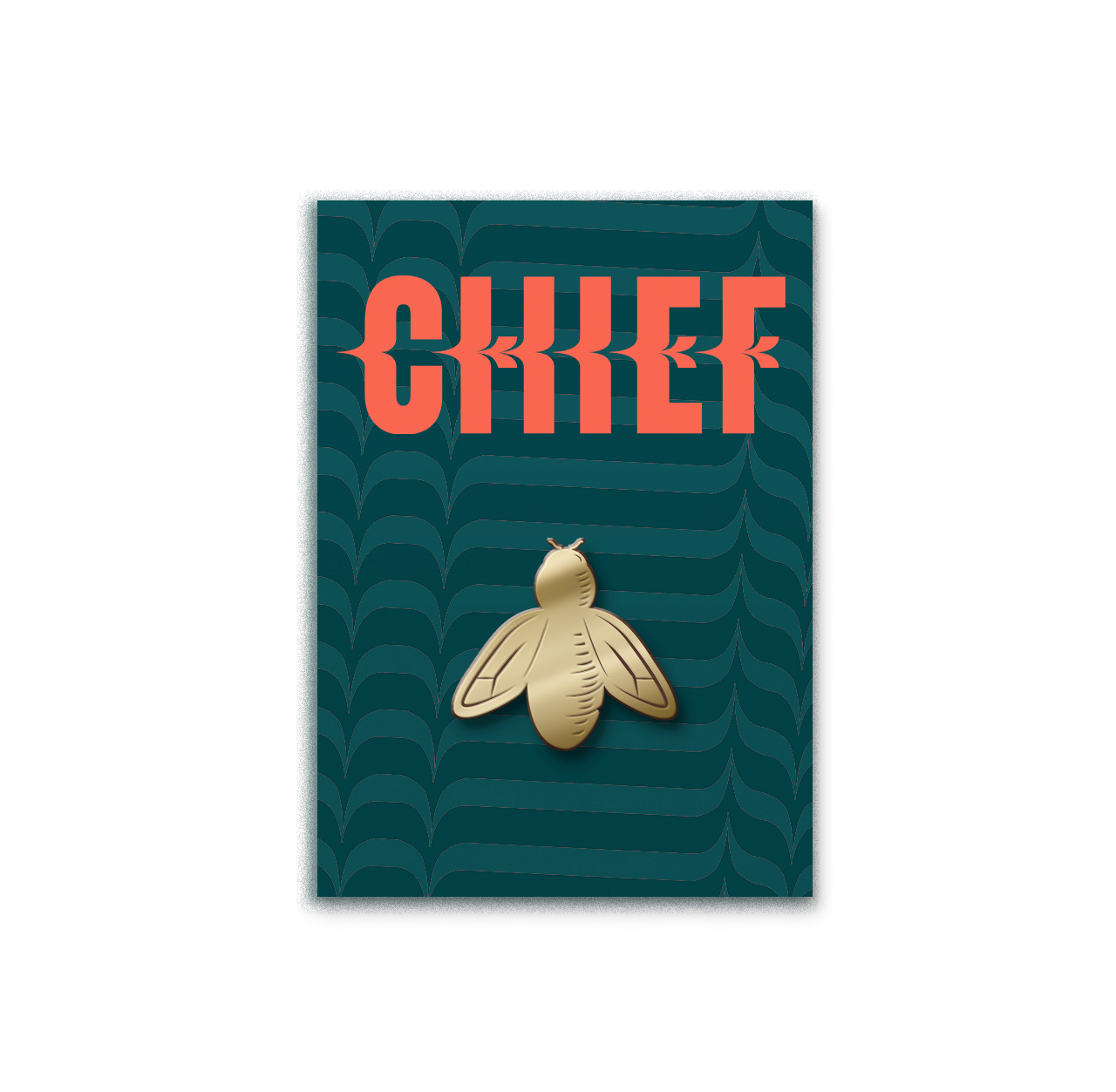
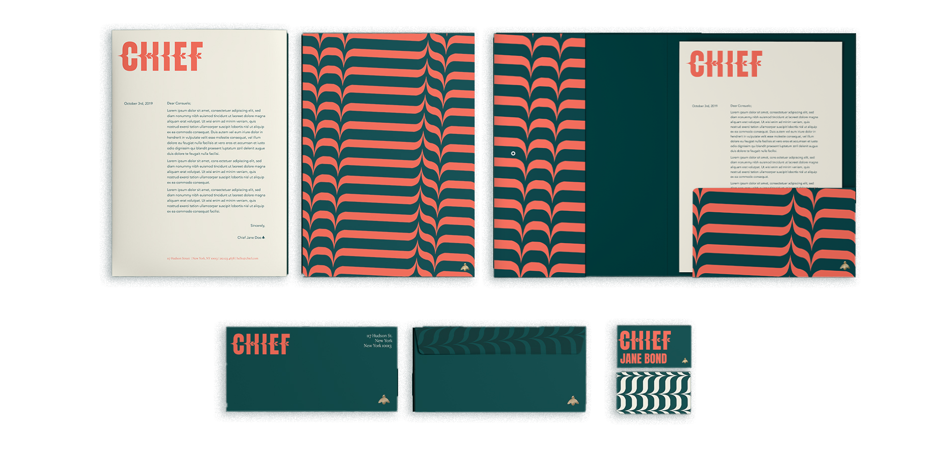
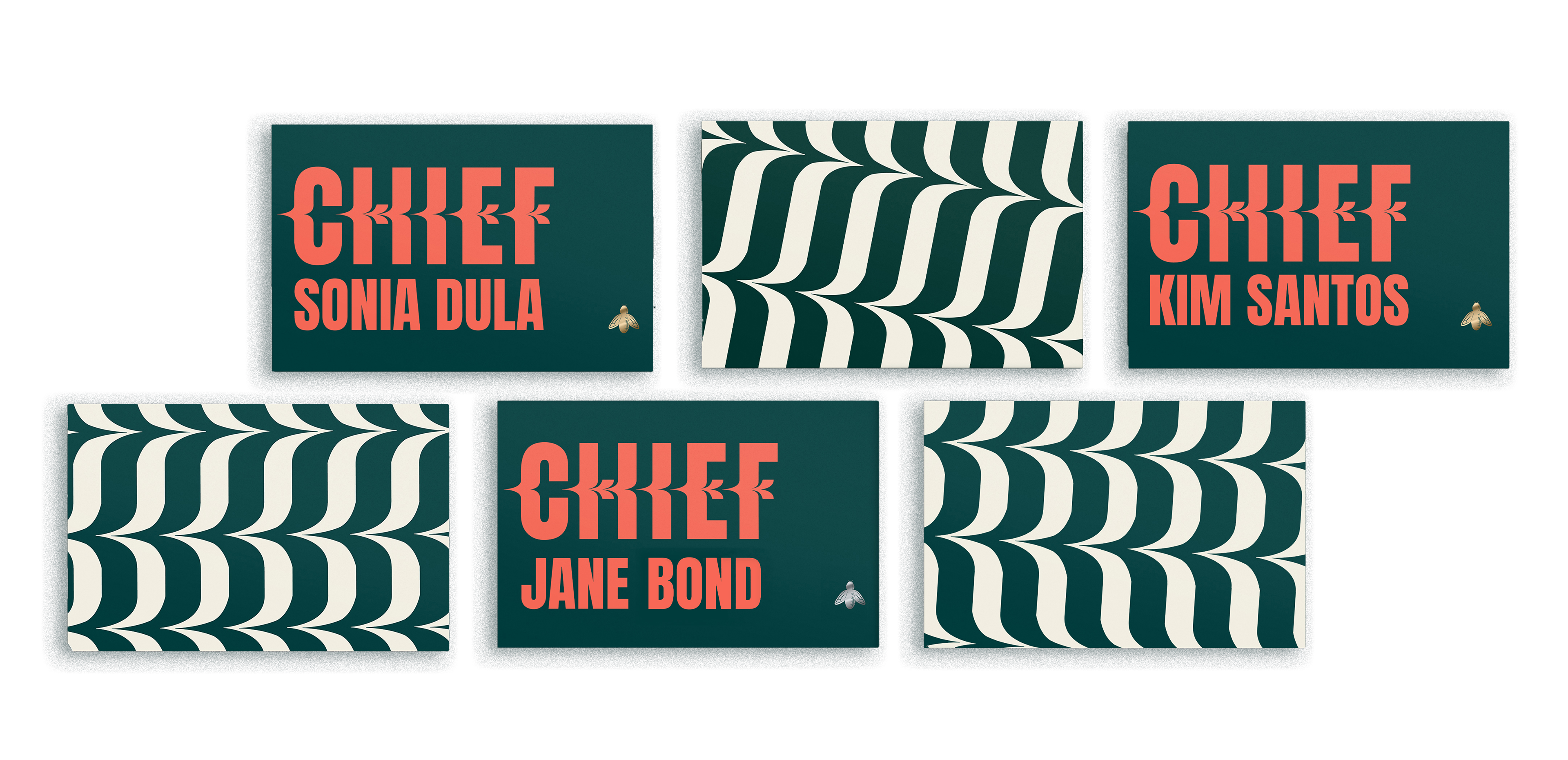
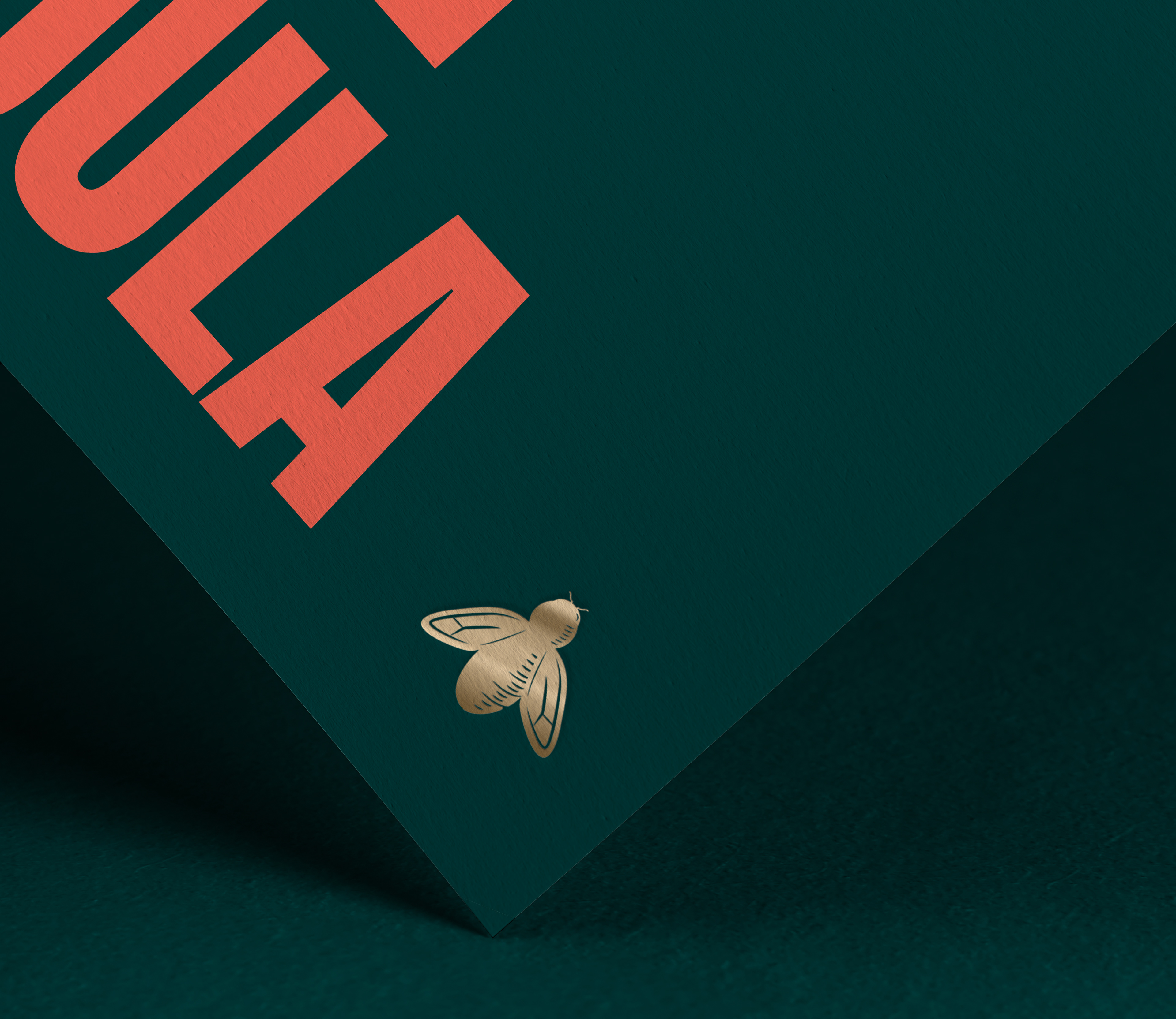
Chief is not generic and is "slashing" the tradition of the "old boys club." The mark represents this. Additionally, since Chief is all about networking and building each other up, the bee work as the company's icon since honey bees are also a matriarchal society.
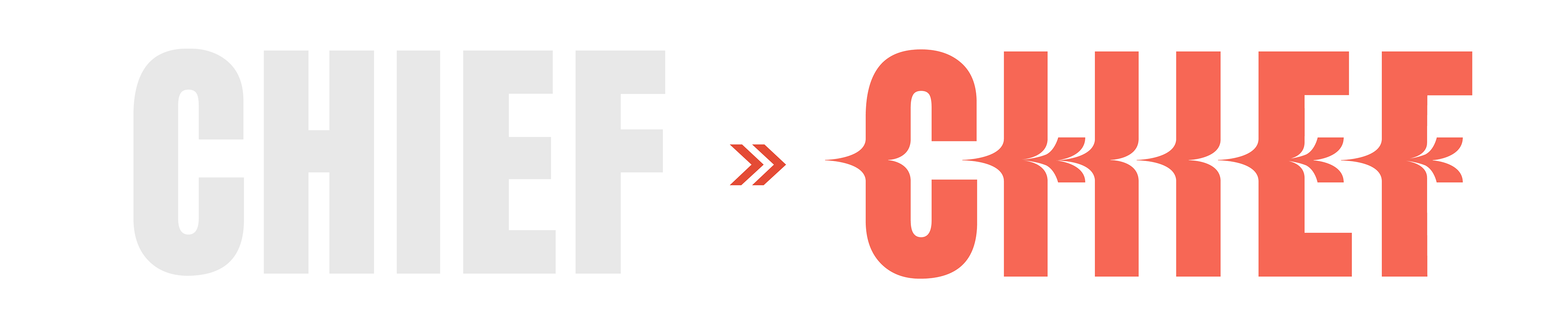

Chief is slashing the tradition.
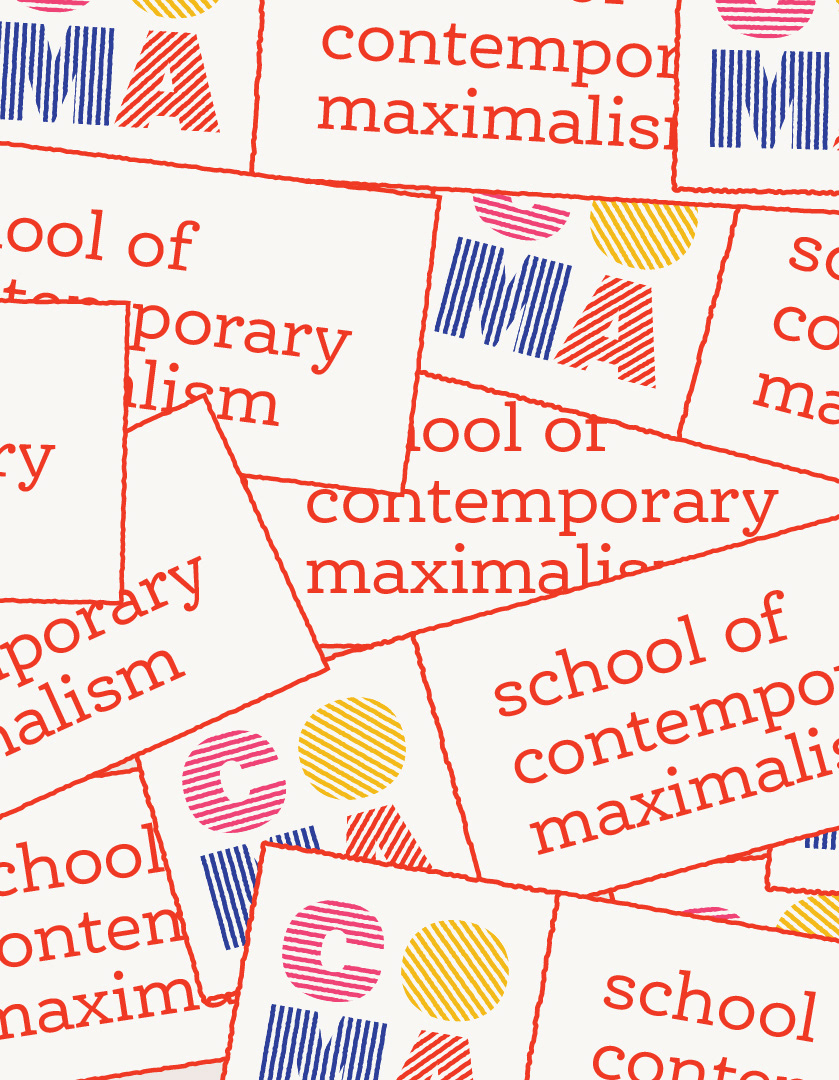
Chief's members are used to luxury and customization. I designed a new display typeface for Chief, basing it of the bold typeface used for headlines to be used sparingly. Chief Display illustrates the ripple/slashing effect Chief hopes to have as a company.
For a body typeface a delicate serif one with a lot of personality offers a nice contrast against the boldness of the condensed headline typeface.
Anton Regular | Headlines
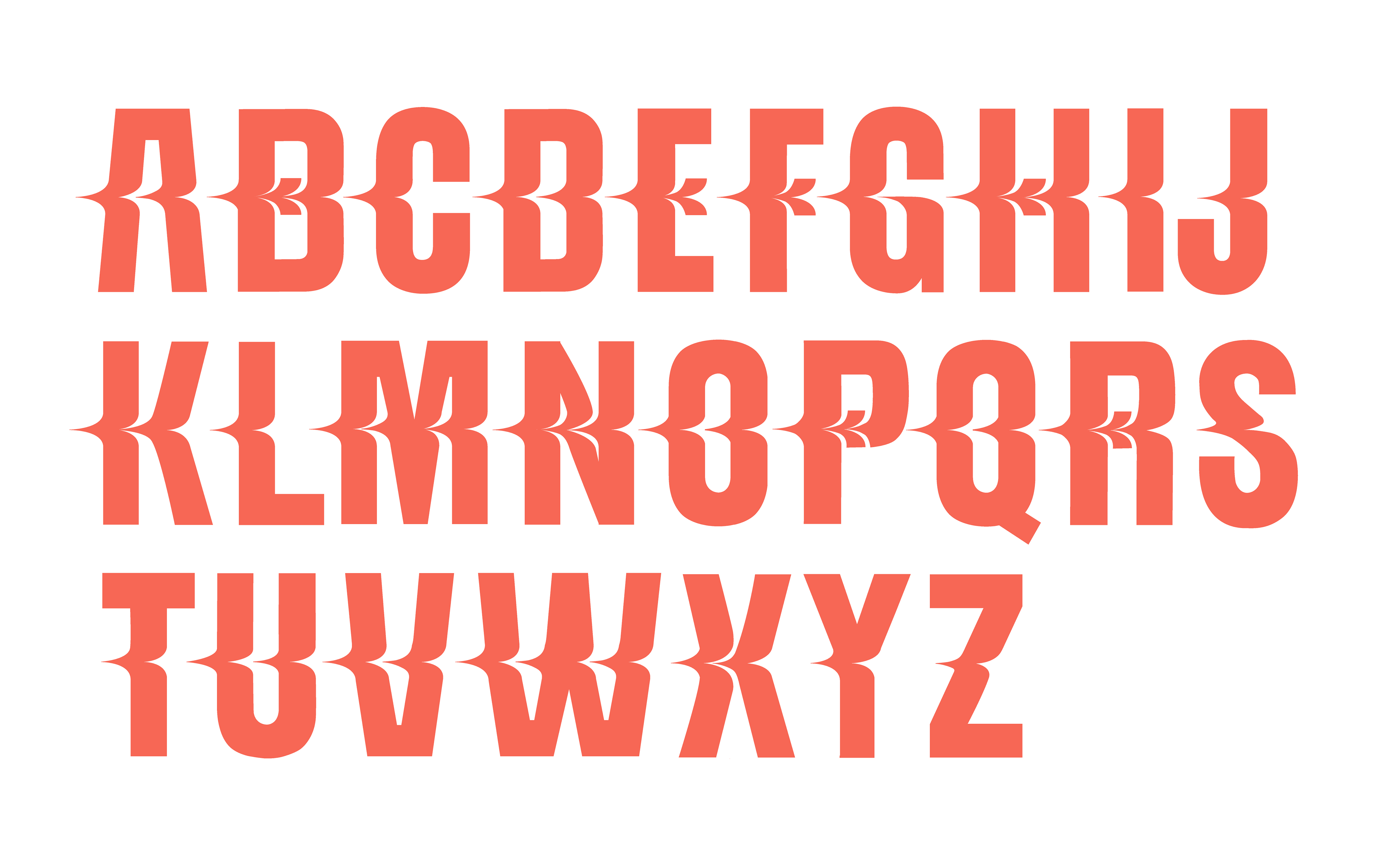
Chief Display | Custom Typeface | Use sparingly
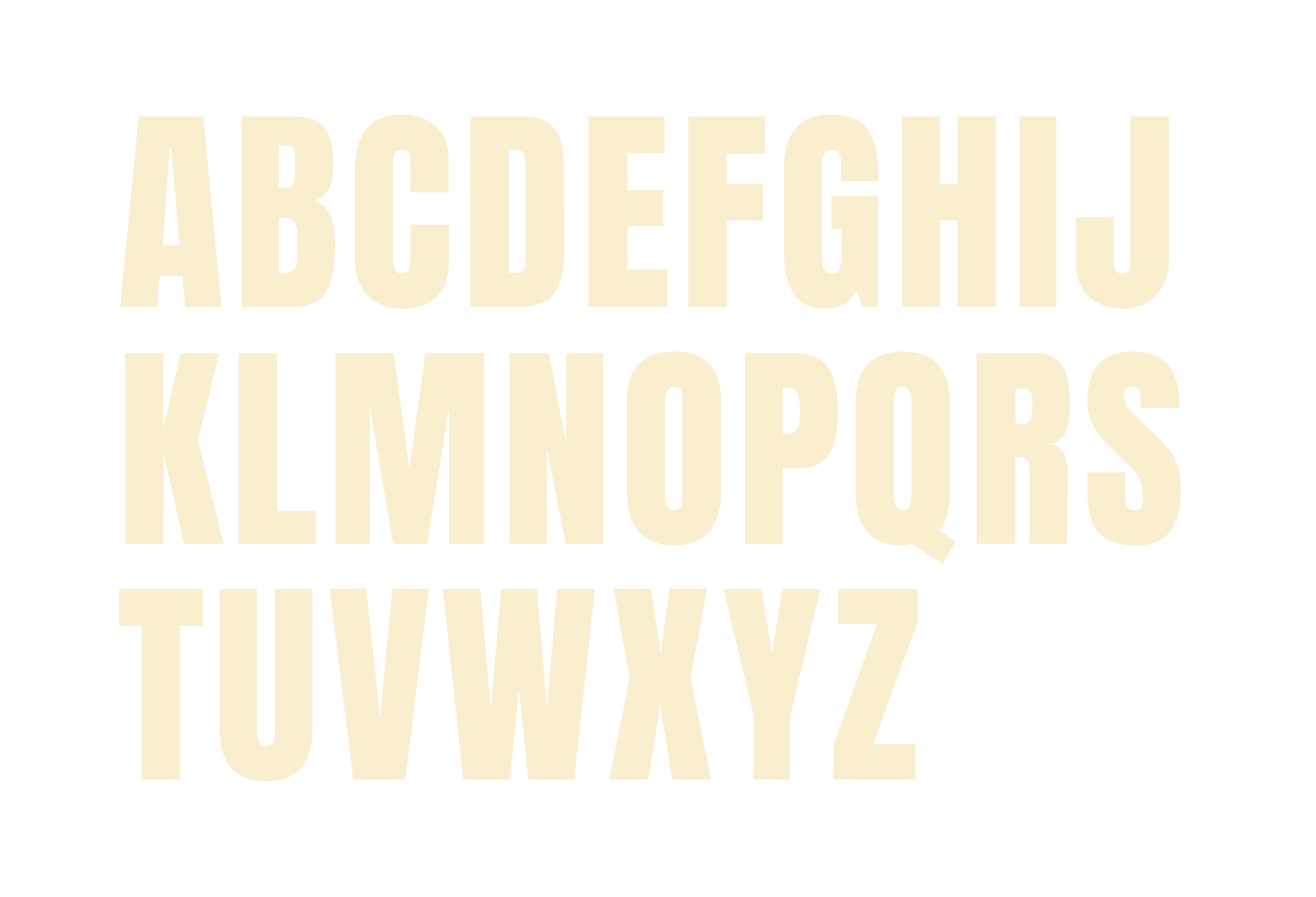
Canela Deck Light | Body Text
Chief doesn't do tote-bags.
Chief's merchandise is highly branded and even though it not necessarily says "Chief" it has the bee as a recognizable mark. The enamel pin will be given to members as a way to identity each other when in public.
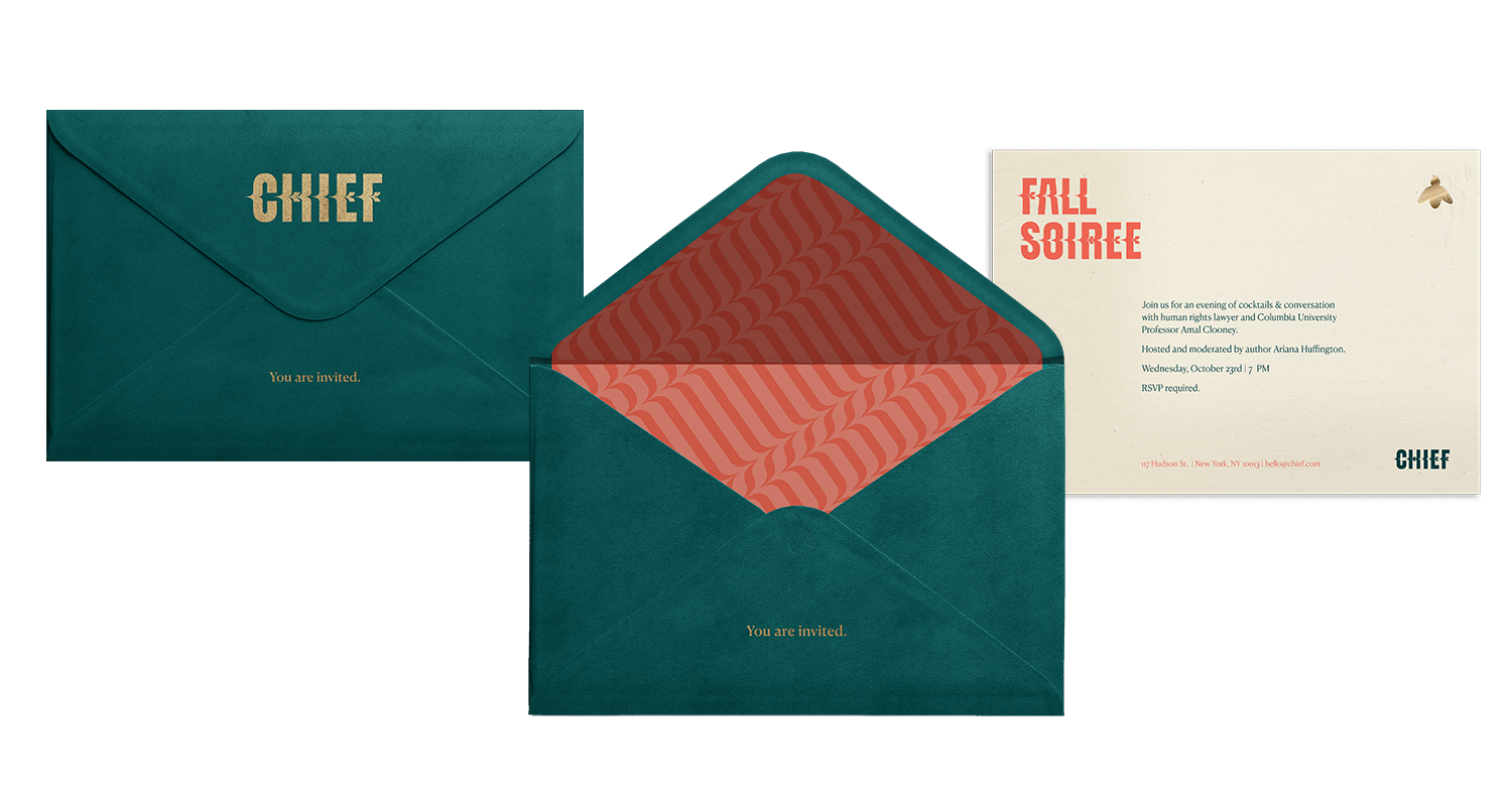
Variable patterns inspired by the slashing of the logo are used also in the letterhead and stationary of the brand.
Chief needs no introduction.
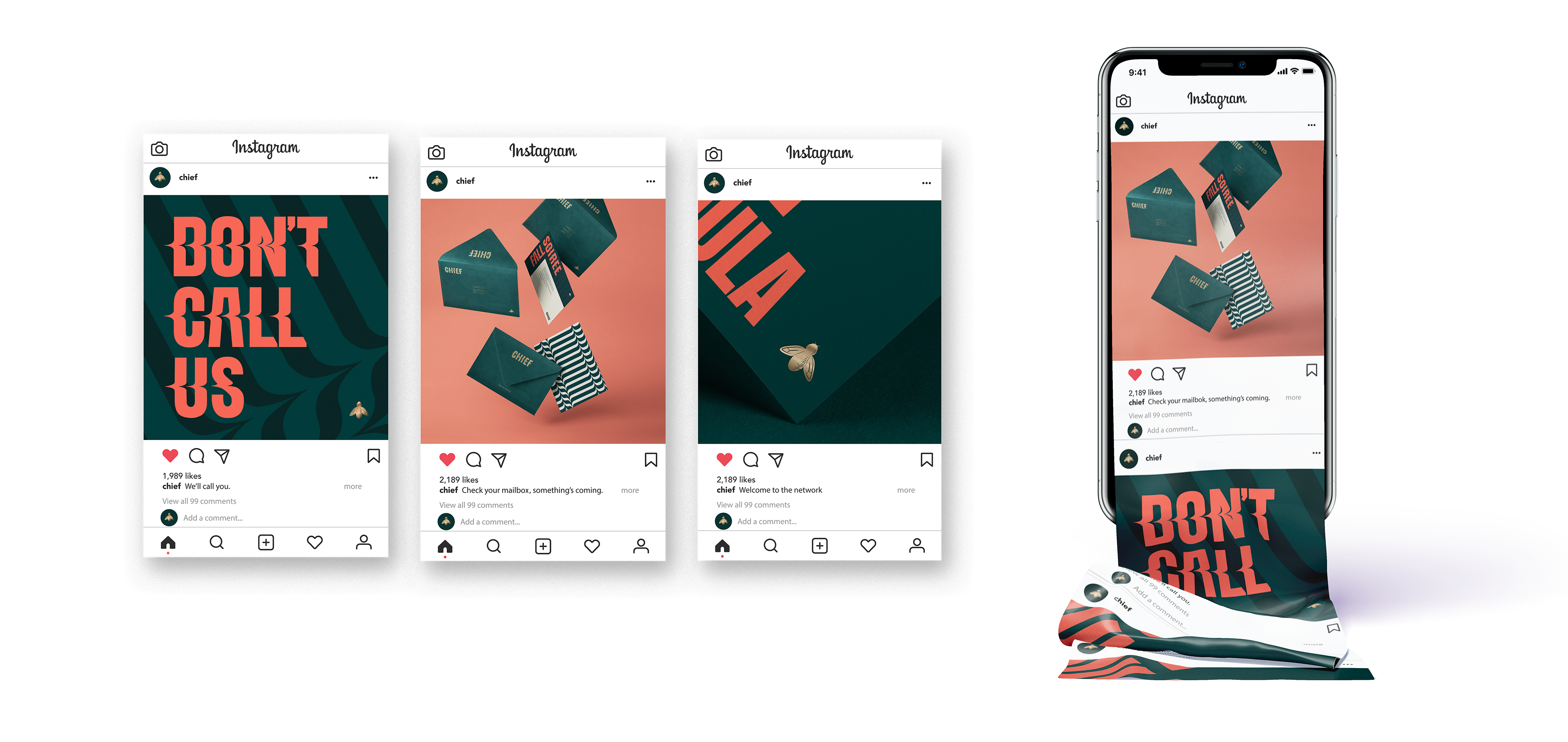
Chief has a daring voice.
Along with the identity, a social media voice has also developed for Chief. They are irreverent, detailed oriented and visually striking.
Chief hosts unique events.